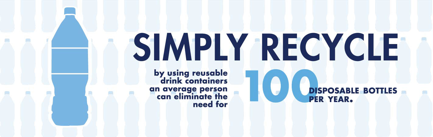
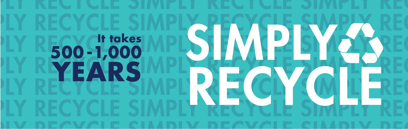
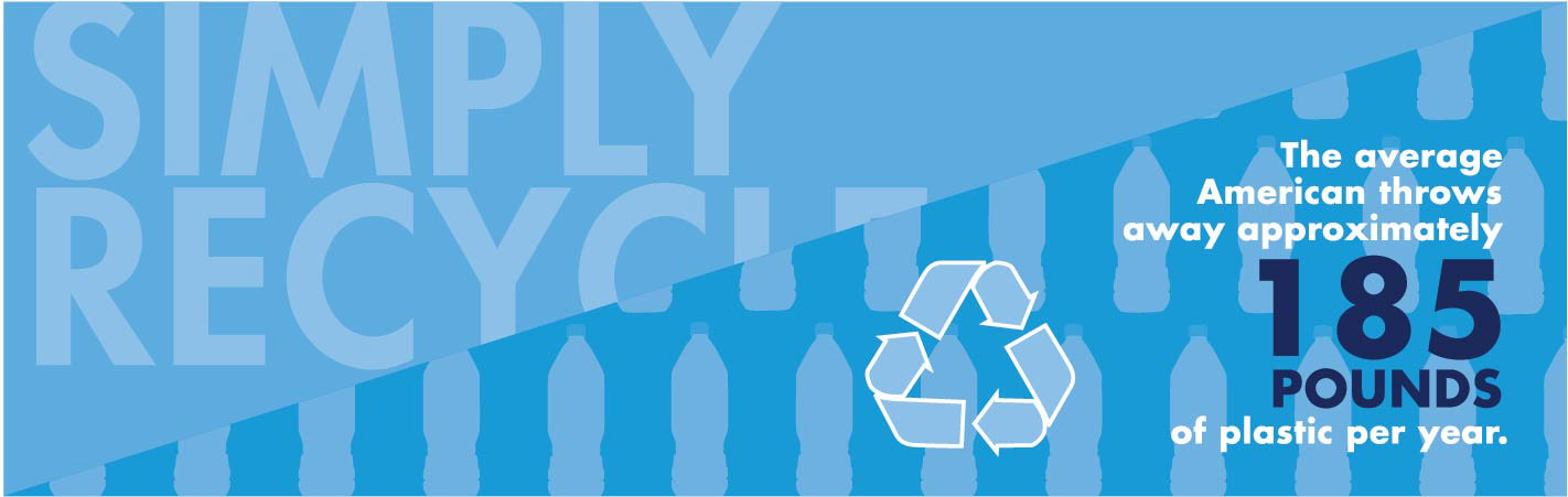
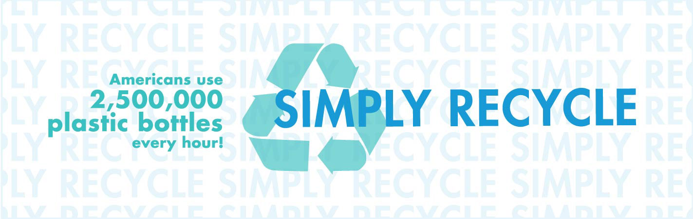
The basis of this project was to create four banners revolving around recycling and sustainability that will wrap around recycle bins located on SDSU’s campus. I believe the strongest campaigns are the ones that are simple and can stand alone. The solution I came up with is “Simply Recycle. It was important to come up with a two letter phrase that can easily be passed around. “Simply Recycle” is a reflection of the simple act that everyone can do it and it’s a positive effect on the environment. The design concept for the banners was to create a unique pattern using type and icons. The plastic bottle and recycle icon were chosen because of how universal and recognizable they are. The phrase “Simply Recycle” is utilized not only as the main message on each individual banner, but it is also used as a design focal point by creating a repeated pattern. The idea behind emphasizing the typography in the design is because of how bold of a statement “Simply Recycle” can make. It’s important to have that phrase become the campaign. Each banner also displays a fact about recycling plastic which helps promote this action of “Simply Recycle”. Blue is the color of recycling, thus emphasizing it with tint and shades of teal and dark blue make the overall design cohesive. The color palette is inviting to the viewer and promotes a liveliness and modern presence.
Process
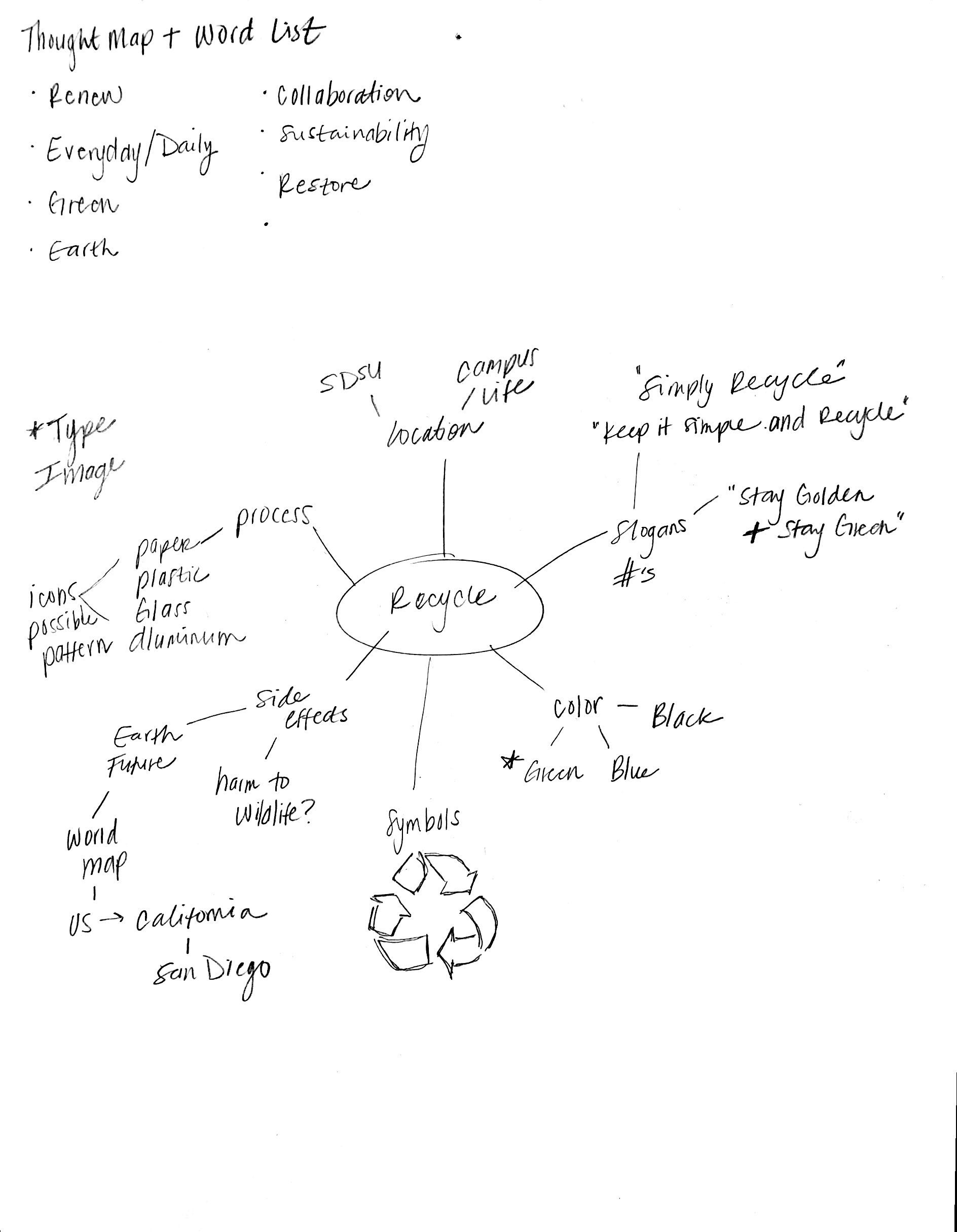
Recycle : Word List / Thought Map / Initial Sketches

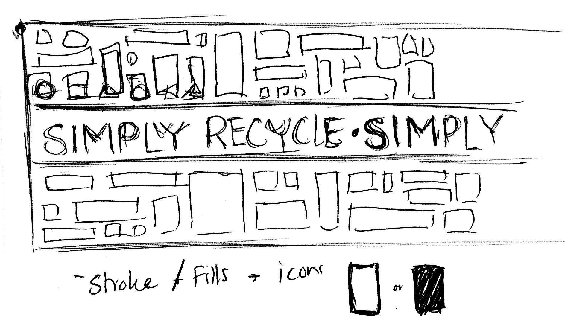
Initial concept
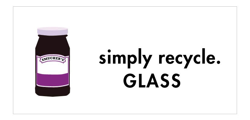
Draft 04
